ui design project: desktop site
UI Design Course: Fall 2021 / UCLA Extension
Moviegoing made easy
Love going to the movies but have a super busy schedule? Let us help you find a movie to relax to and enjoy!
01. Project overview
Think of a desktop site or application that you use all the time but wish were better. Design a new version of this site or application.
my role
This was an individual class project, so I conducted competitive analysis, created the site map and a user flow, and iterated on designs from concept sketches and rough wireframes to a hi-fidelity design.
02. The Problem
It is common for movie theater audiences to purchase movie tickets before arriving at the theater. There are many websites that allow people to buy movie tickets and select seats ahead of time, however, many of these websites are not intuitive to use. For individuals who have limited windows of time to watch movies, such as parents of young children or teenagers who have a curfew, it is a laborious task to search, compare, and discover the best movie options that fit their busy schedules. Additionally, these websites are often bombarded with ads and pop-up windows that make the movie selection and purchasing experience even more time-consuming.
problem statement
How might we create a new movie search and ticketing experience to help busy individuals quickly choose the best movie choices that fit into their schedules?
03. the Solution
This solution was designed for individuals who have limited windows of time in their schedules to watch movies at the movie theater. It is a movie search and ticket purchasing website that takes into account a movie’s start and end times, the length of the movie, and the individual’s availability to watch a movie.
04. the process
research
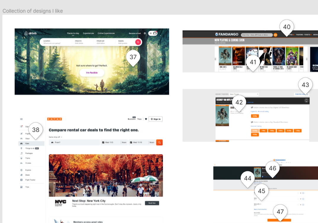
I began by conducting a competitor analysis to understand the current landscape of websites that allow users to search and purchase movie tickets. I reviewed four popular movie and movie theater websites — Fandango, movietickets.com, AMC Theatres, and Regal Cinemas. I analyzed these websites’ search functionality, search results display, movie details, and purchase & checkout functionalities based on best practices and common conventions in UI patterns, fundamentals in navigation, and design principles for forms. Furthermore, I researched sites in other industries that I felt demonstrated simple and intuitive UI/UX for search functionality and results, specifically search results that involve scheduling and time windows — Airbnb, Kayak, and Hipmunk.
My complete analysis and brainstorm can be viewed under “Comments” in this Figma file: Competitive Analysis.
Key Takeaways
1. Keep the homepage visually engaging with movie poster images but decrease clutter.
2. Provide search results that take into account the user’s schedule and the length of the movie.
3. Differentiate between primary and secondary buttons to give users clear calls-to-action.
4. Decrease the number of screens and design for error prevention during the checkout process.
site map & user flow
After consolidating key takeaways from my competitive analysis, I laid out a general site map and one user task flow for a key interaction for my website design. My goals for the site map and user flow are to allow users to acquire showtimes information quickly and to purchase easily. I created multiple user pathways to search and see movie details and showtimes on the homepage, and I limited the number of checkout screens to three screens.
Download to view the site map and user flow: Site Map & User Flow.
concept sketches & low fidelity wireframes
Based on my site map and key user flow, I created three variations of concept sketches and two variations of low fidelity wireframes.
Download to view all Concept Sketches and Low Fidelity Wireframes.
high fidelity designs
I chose designs from both wireframes to create my High Fidelity Design (Figma file). In this design, I followed fundamental design principles of hierarchy, alignment, symmetry, and typography. For the majority of the site, I used Libre Franklin and Cabin for headers, sub-heads, and labels paired with Libre Baskerville for the body text to create a clean and classic feel.
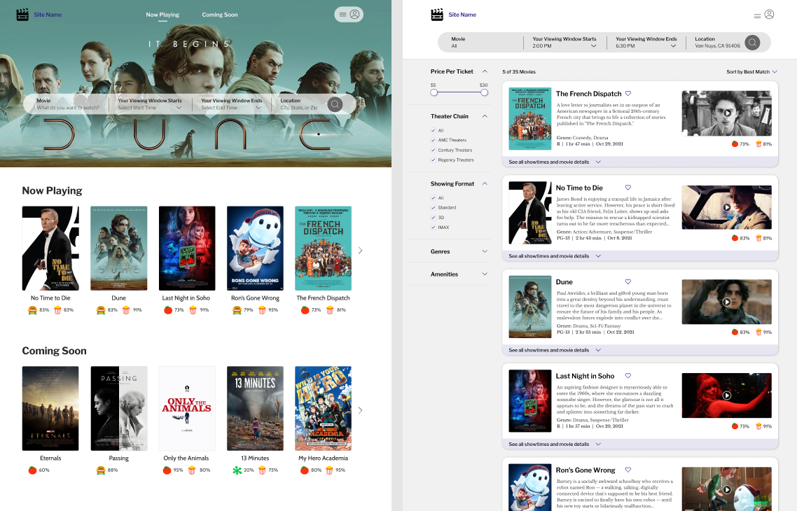
For the homepage, I limited the use of body text to highlight the visual movie poster images as the main focus of the page. To draw attention to the search functionality, I designed the search bar at the top of the page and utilized a movie poster as the banner image.
On the Search Results page, I maintained the search terms at the top of the page, so users can easily recall their search criteria. The filters on the left provide users with control and freedom to sort their search results. I included the Rotten Tomatoes and Yahoo! Movies ratings on this page so that users do not need to return to the homepage to see these details.
When users click “See all showtimes and movie details”, each movie search result expands to show the theaters and showtimes that match their search criteria. Here, users can also access Movie Details, Map, and Reviews of that specific movie. With the design of the expanded details, I hope to achieve more efficiency of use so users can view details of all the movies in their search results without having to navigate away from their search results or open up a new tab. Users can easily close the expanded details of one movie to expand the details of another movie.
The design of My Movie Cart is intentionally simple with only 3 screens, including the Purchase Confirmation screen. Users can see where they are in their checkout process at the top of the screen and are always reminded of the movie, theater, and showtime details of the movie they selected.
05. learning & reflection
Expand research and competitive analysis. Looking at competitors who service the same industry provides insights into pain points and common conventions, but researching outside of the industry helped me to generate designs and interactions that I could apply to this project. I was able to identify popular and well-designed interactions on flight-purchasing and vacation rental websites that served similar user needs.
Start sketching and generating ideas. Not all design ideas are good ideas, but it never hurts to sketch out all ideas to visualize the user flows. My final high fidelity design incorporated different screens from all of my original sketches, so it was valuable to put these ideas down on paper in the early parts of the design process.
Ask for user feedback early and often. If I had more time during this project, I would have wanted to ask for feedback throughout the entire design process — from sketches to wireframes to the high fidelity design.


